
There is a subtle element of design which cannot be stressed enough and is absolutely necessary to creating a positive interaction with your customers, and that is user experience. Everybody’s talking about UX now, but good designers have understood its importance long before the term was ever coined.
What does this mean for business owners? It means a lot because if you want to keep your customers, they have to be able to easily navigate your website, mobile app, or whatever platform it is.

Allow users to seamlessly perform tasks.
What does a good UX feel like? It might be best to first ask, What does a bad UX feel like?Quality UX design allows the user to perform an operation seamlessly.
If they are hindered, frustrated, or confused by the process required to perform the desired operation, then that’s bad design—and it’s really that simple. The difficult part is engineering your design to produce that seamless experience.

Enter the knowledge gap.
I will defer to an expert to describe this pivotal mechanism that designers use to create the perfect UX.
In his article, “What Makes a Design Seem ‘Intuitive’?” Jared Spool teaches us how to identify something called, “the knowledge gap,” which can tell a designer exactly how to design the interface to make sure users don’t run into roadblocks.
Collecting data: Understand the user’s current knowledge and the target knowledge.
The knowledge gap is derived from two pieces of information—current knowledge and target knowledge. As Spool describes it, “current knowledge” is the amount of knowledge a user already has when they approach the interface; “target knowledge” is the amount of knowledge they need, for them to be able to accomplish their objective.
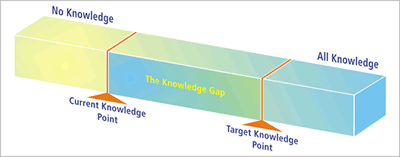
You can see here how this space comes into play; it is within the knowledge gap that design should be happening. Nothing needs to be designed below the current knowledge point because users can already get to that point by themselves, and there’s no need to design anything above the target knowledge point because users won’t need that information to perform the task.
This is an invaluable design tool for optimizing UX because if you can discover the knowledge gap for every individual aspect of your design, then you can be reasonably sure that users will have the ability to navigate through everything with ease.
It’s not always an exact science, but you can get pretty close with some research and trial and error.
Where is that button?!
When someone is looking for something on your site, and they are unable to find it quickly, that’s a perfect example of poor UX. Everything should be where users expect it to be.
That means things like contact information for sales-related questions, or content that promotes your product or service is probably what you want to put in the foreground or prominent pages.
It’s also good to keep in mind, at the same time, that there’s no need to change your whole design for the screaming minority who demands that you should put this or that in a place where you know it shouldn’t be.
There is a flip side to that coin. There may be clickable items, for example, that should be hidden from the user until those items are needed because it could derail them from the path they need to take through your site, or potentially prevent them from converting into a customer.
One of the elements of UX that you will want to pay the most attention to is flow.
Creating the appropriate flow through your interface has a lot to do with logic and the psychology of the user. When someone hits your landing page and starts scrolling down, what are they going to do next?
You have to be able to discern what a user is trying to do and to lead them naturally to where they are trying to go just by placing the necessary instructions, navigation messages, or links right where they should be.
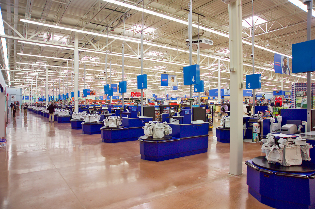
Walmart knows what you want.
To illustrate this idea, just imagine yourself walking through the door into Walmart. That is one company that has its flow down, cold. The floor plan, departments, pay stations, and everything else is placed where it has been placed for a reason.
It’s like the cereal aisle in a grocery store. They put the sugary kids’ cereal on the lower shelves so that kids will grab it and demand that Mom buys it for them.
And that’s just the tip of the iceberg. You can put your sugary cereals on the bottom shelf, too, so to speak; you just have to understand who’s looking for the sugary cereals, and put it in front of them.

Stephanie
Stephanie is the Marketing Director at Talkroute and has been featured in Forbes, Inc, and Entrepreneur as a leading authority on business and telecommunications.
Stephanie is also the chief editor and contributing author for the Talkroute blog helping more than 200k entrepreneurs to start, run, and grow their businesses.